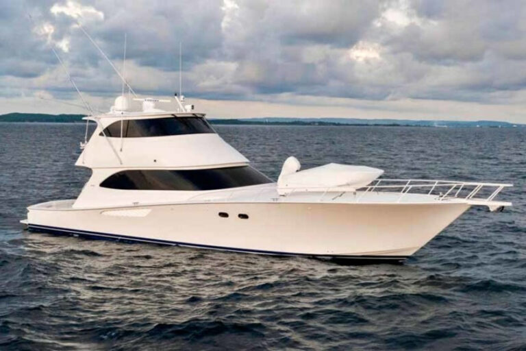
Yacht design can be a tricky thing, especially if a brand has been successful with a style it calls its own.
Since 1964, Westport has been catering to an American clientele whose tastes lean more toward the traditional than most European yacht owners. Think homey, warm and unapologetically conservative at a time when European interior design has trended contemporary, minimalist and avant-garde.
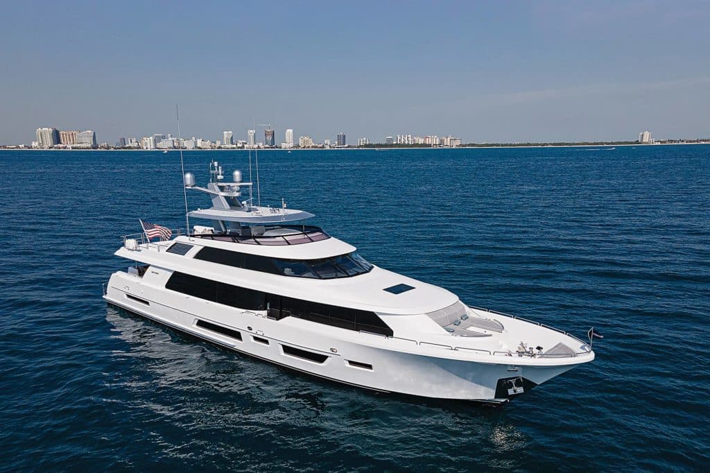
The Westport 112 has long been the builder’s most popular model, with 65 hulls launched from its Washington state shipyards since 1994. That number is not only a superyacht record, but it shows how forward-thinking the initial design was. “The volume’s fantastic for its size,” says Sylvia Bolton, lead designer. “It’s no wonder we’re at Hull 65.”
Of late, though, a younger group of yacht owners has entered the market, asking Westport to create more-contemporary interiors and exteriors. “We had this great vessel with excellent engineering, but we could see market changes,” Bolton says. “That made everyone feel a bit anxious about what was ahead.”
What was ahead, it turned out, was Book Ends, the yacht that signaled a turning point not only for the 112 but also for Westport itself. “It’s as different as it can be from the last generation without actually changing the layout,” Bolton says.
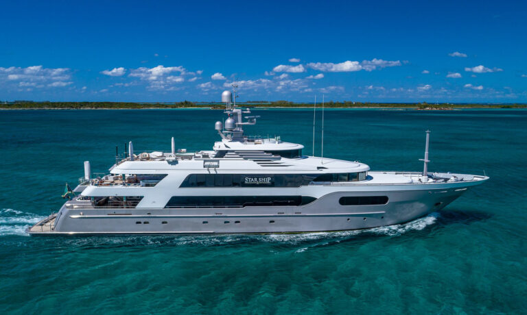
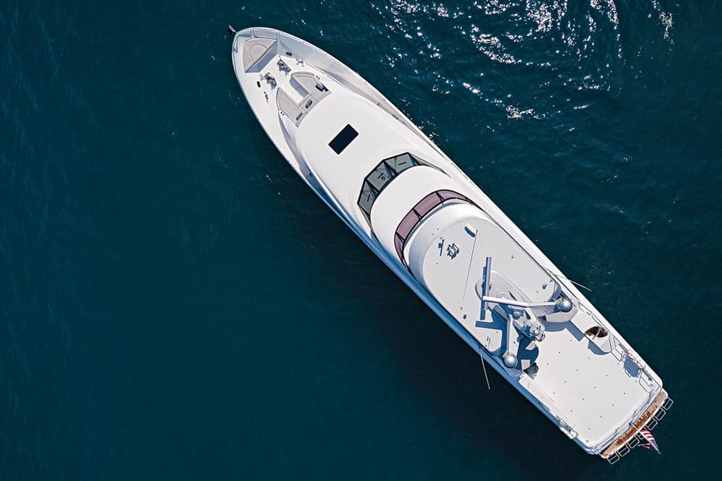
Westport changed the exterior somewhat, with longer, more-contemporary hullside windows and larger glass in the superstructure that provided more natural light and a modern profile. But the big changes came inside.
“The idea was to open up the space and reorganize the rooms in terms of usage,” Bolton says. “It was a balancing act since the design is so well-established. People wanted new, but they didn’t want to see too much change.”
Instead of viewing the 112 as a blank canvas that needed a complete makeover, the Westport team redefined specific areas, pulling out cabinets in the main-deck companionway, redesigning the stairwells, and placing vibrant art in unexpected areas. By unblocking views between rooms, using contemporary woods and stones, and leaving the actual layout untouched, Book Ends became the poster child for the new Westport.
Less was more for Bolton and her team. The salon now looks more open and modern. Colorful artwork defines the forward wall of the dining area, while a sculptural lighting system is above the table. Throughout the yacht, oak is a primary wood, but instead of the classic look, a Rousseau finish is used; the grain runs horizontally, with a subtle white filler that gives it a rich, contemporary feel.
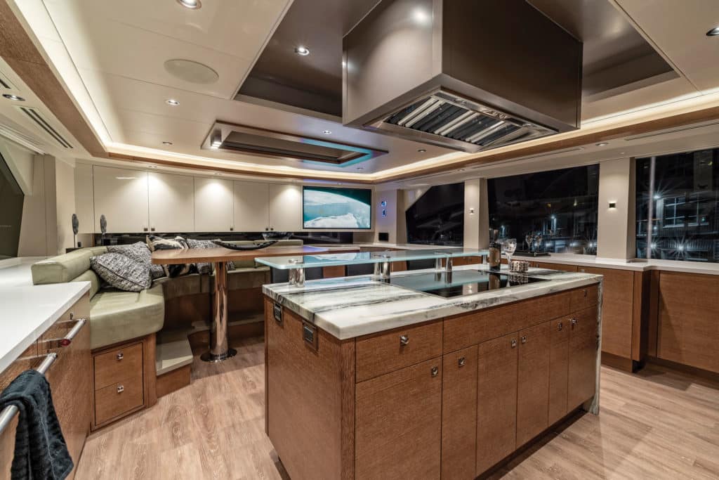
Bolton also focused on the stone, using a large, overflowing piece of marble in the center of the galley that looks like a sculpture. Calacatta marble updates the master stateroom’s en suite shower.
“I pay attention to the quality of the materials—but also their visual and tactile characteristics,” Bolton says. “I want them to look organic and multidimensional.”
Book Ends offers something new while maintaining Westport’s brand DNA. For yachtsmen who value tradition but also want a bit of pizazz, this builder is a good place to look.
The Art
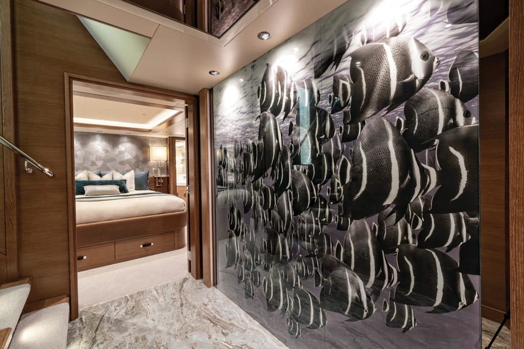
Designer Sylvia Bolton associates the color blue with sea life, so she added custom sculptures and photos to create texture and vibrancy. On the lower deck, just off the stairway, a wall that usually would be covered in solid wood or fabric is home to a full-height picture of a school of reef fish. The size and realism are a surprise. Similarly, there are two life-size reef sharks swimming over a textured blue wall on the main deck, between the salon and galley. “I didn’t want to put something out there that didn’t have its place,” Bolton says. “The goal is to give people something that is more than an interior but has an identity.”
The Pilothouse
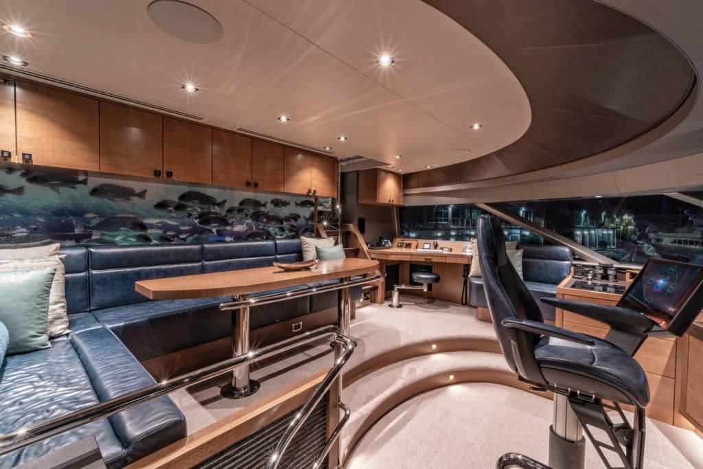
To make the helm more of an area for social gathering, the height of a side lounge was lowered, the helm console was streamlined, and darker, more-contemporary colors were used in the bulkheads. Lucite panels beneath each step create “floating” stairs to the flybridge, and a large mirrored piece of printed Lucite is on the after bulkhead. By day, it looks like a smoky mirror; at night, it makes the pilothouse feel like a whimsical coral reef. “I wanted more than just another wall—something fun and interactive—so we created a printed mural of swimming fish,” designer Sylvia Bolton says. “When it’s dark, the wall lights up and the mural reflects onto the windshield, so the pilothouse feels alive.”
The Staircase
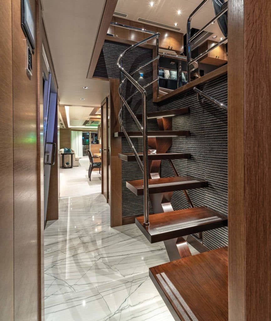
Changing the design of the staircase from the main deck to the pilothouse opened up both levels. Before, the radial staircase stuck out into the companionway. Now, open stairs with a stainless-steel rail look more modern. The design team also replaced a companionway cabinet with interior cabinets. The straight, uncluttered companionway now runs forward from the main salon. “The idea was to straighten edges and remove corners so there’s nothing that impedes the view,” designer Sylvia Bolton says. “The new staircase is the most visible detail that adds light and space to the main deck.”
The Galley
The Westport 112 has a country-kitchen galley. Book Ends added two TVs, forward and aft, with lounges for viewing. The island is the most dramatic change, with a single piece of Marble Glacier that designer Sylvia Bolton hand-picked. It flows over the side for a sculptural effect. “Stone can make or break the space,” she says. “It can take months to find the right piece, and the right stone can even make you change a design to accommodate it.” The centerpiece modernized the galley without changing its layout. The day I visited, Book Ends’ crew were sitting around it, chatting about a trip to the Bahamas.
Take the next step: westportyachts.com

